It’s been a few months in the making and I’ve still got quite a bit to go — but it’s a start.
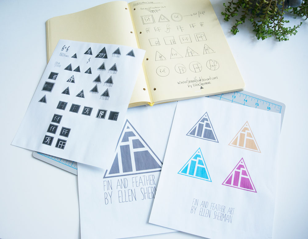
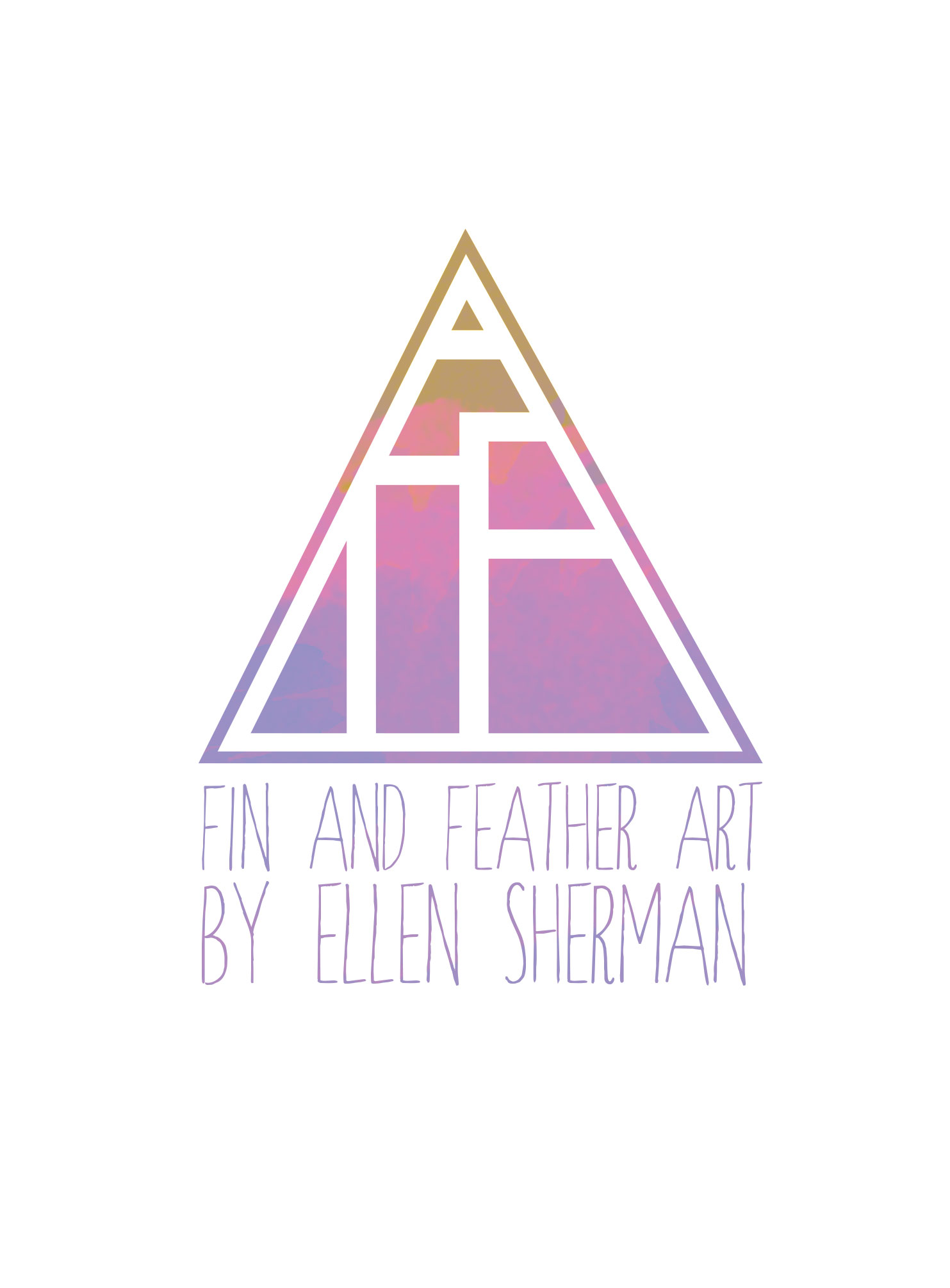
I’ve been using the time in between projects to create a new logo for Fin and Feather, and I am so excited to finally be able to share it. I was looking for something that focused a bit more on the “F +F” part of the brand, and something that would be a bit more iconic than the whole title written out.
I also am really excited to make stamps out of it.
With those considerations in mind, I made hundreds of versions of “F + F”, “F&F” and “ff”s, until I couldn’t recognize the letter anymore. Brain was lettery mush.
It’s a really hard thing to design for yourself I think, to design for your own brand. With clients, though each project is always a good challenge (or I wouldn’t have taken it on) I feel like it is a fairly straight shot from brainstorming, to prototyping, to final work. To objectively portray the qualities in a branding system that effectively delights the client has been not easy persey, but definitely straightforward.
To design for me, however. That was a trick.
I couldn’t tell if I actually liked what I was making in that it spoke how I wanted it to, or it was just pretty to look at. My compass was all off kilter.
Thankfully I’ve got a great network of designers to lean on in times like these. No man (or woman) is an island, and it’s never more apparent to me than when I’m struggling with my work.
All and all, I think the final version is what I was hoping for. It also allows for a lot of play within the confines of the logo – so that makes me happy.
It will also make awesome stamps.
I’ll be in the process of updating everything over the next few weeks, so make sure to check back for a new and improved Fin and Feather <3<3


